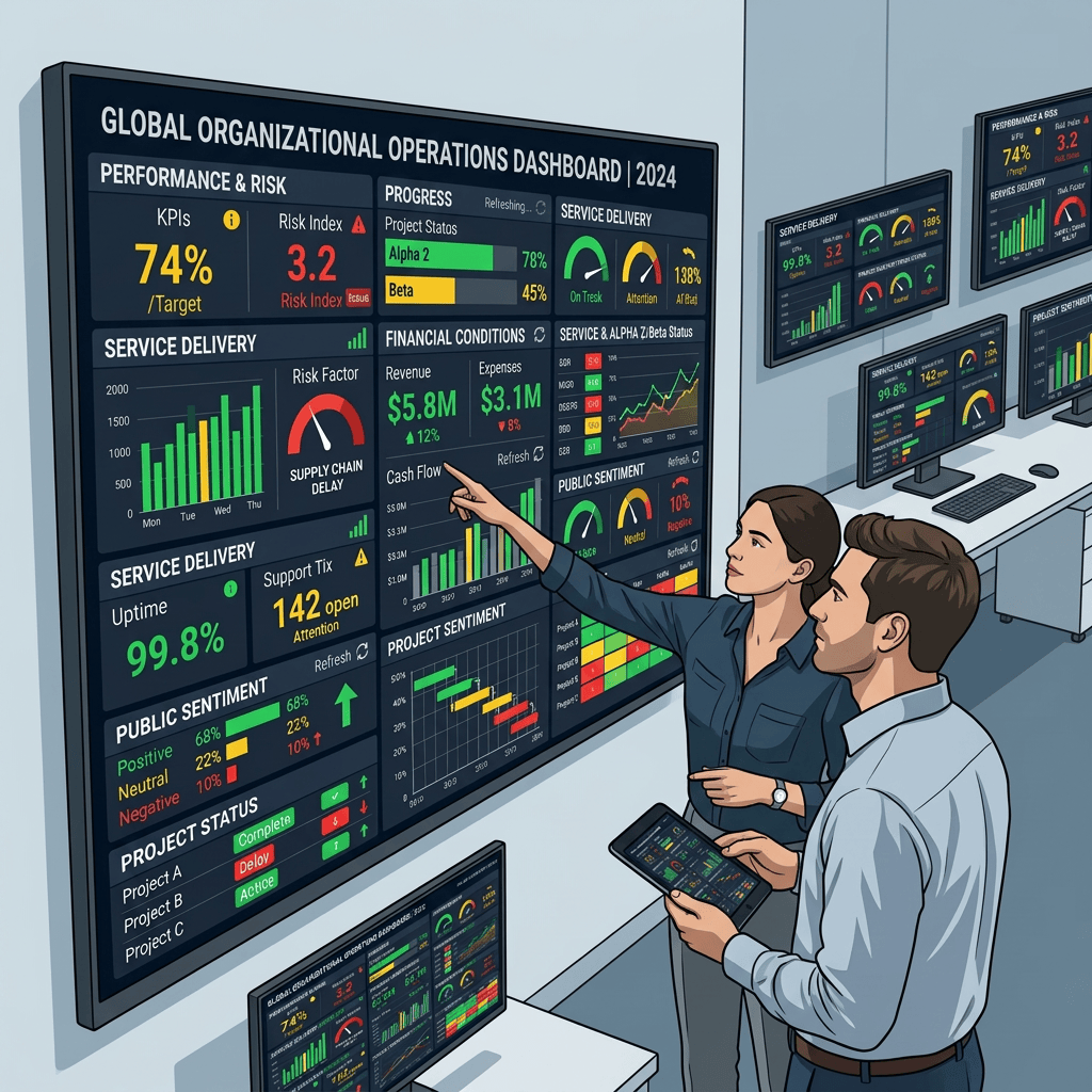
A modern organization can increasingly be understood through a screen.
A dashboard displays performance, risk, progress, financial conditions, service delivery, public sentiment, project status, and organizational targets. Red signals a problem. Green suggests stability. Yellow indicates attention. Trends move upward or downward. Numbers refresh in real time, and complex institutional conditions appear to become immediately visible.
The attraction is understandable.
Organizations have always struggled with complexity. Leaders cannot observe every activity directly, read every report, speak with every employee, or understand every local condition in detail. Dashboards offer a practical solution by compressing large amounts of information into a visual form that can be interpreted quickly.
They make organizations legible.
Yet this legibility comes with a condition that is easy to overlook: what appears on the dashboard is not the organization itself.
It is a representation of the organization.
The difference between those two things is where some of the most important questions of contemporary governance begin.
The Rise of the Visible Organization
Digitalization has changed the way institutions see themselves.
In earlier administrative systems, organizational knowledge moved slowly. Reports were collected periodically, analyzed manually, and presented through documents that often reflected conditions from weeks or months earlier. Decision-makers operated with substantial informational delay.
Today, many organizations can observe selected dimensions of their activities almost continuously. Transactions can be counted immediately. Service completion rates can be tracked by hour. Complaints can be categorized. Projects can be mapped. Financial performance can be visualized. Operational risk can be ranked.
This creates a new form of institutional visibility.
The organization increasingly appears as a collection of measurable signals.
Such visibility can generate real benefits. Problems may be detected earlier. Performance differences between units can become easier to identify. Resources can be redirected more quickly. Leaders can make decisions using information that would previously have been unavailable.
Data visualization can therefore strengthen institutional awareness.
But every visualization begins with selection.
A dashboard cannot display everything.
Someone decides which indicators matter, which variables should be monitored, how frequently data should be updated, how thresholds should be defined, and how information should be arranged visually.
The dashboard therefore does not merely reveal organizational reality.
It also constructs a particular way of seeing it.
The Architecture of Attention
One of the most important effects of dashboards is their ability to organize attention.
A problem displayed prominently on a screen becomes difficult to ignore. A declining indicator attracts discussion. A red warning generates urgency. A positive trend can create confidence.
This is precisely what dashboards are designed to do.
They help decision-makers focus.
Yet attention is a limited institutional resource. What receives attention in one area may reduce attention elsewhere.
The design of a dashboard therefore has consequences beyond aesthetics.
Indicators positioned at the top of the screen may appear more important than those positioned below. Measures updated daily may feel more urgent than conditions assessed annually. Quantifiable problems may become more visible than qualitative problems.
Over time, what appears on the dashboard can begin to shape what an institution considers important.
This creates a subtle institutional effect.
The dashboard begins as an instrument for observing priorities.
Eventually, it can participate in creating them.
Recent research on data visualization in organizations shows that dashboards are not neutral windows into reality. They operate within broader institutional and political settings, shaping how users interpret performance and which aspects of organizational life become visible or actionable. Studies of datafication have also shown that data-driven decision systems can privilege institutional metrics while making other forms of experience less visible.
This does not mean dashboards manipulate decision-makers.
It means visual systems structure attention.
And structured attention eventually influences judgment.
The Problem of the Green Screen
One of the most reassuring things a dashboard can show is green.
Targets have been achieved. Risks appear controlled. Projects remain on schedule. Performance indicators show improvement.
Institutionally, green communicates stability.
Yet stability on a dashboard does not necessarily mean that the underlying organization is functioning as well as the visual representation suggests.
An indicator may be green because the threshold has been achieved while deeper problems remain unresolved. A project may appear on schedule while quality is declining. Service targets may be achieved while difficult cases accumulate outside the measurement system. Satisfaction scores may improve while groups not represented in the survey remain dissatisfied.
The issue is not that the numbers are false.
They may be entirely accurate.
The problem is that accuracy and completeness are different things.
A dashboard can accurately display every indicator it has been designed to measure while still offering an incomplete picture of the institution.
This is particularly important because visual simplicity creates psychological confidence.
When complex organizational conditions are reduced to a small number of clean indicators, uncertainty becomes less visible.
The dashboard appears definitive.
The institution looks knowable.
Hans Krause Hansen has described how numerical systems can create powerful forms of transparency while simultaneously generating what he calls transparency illusions. Numbers can increase visibility, but they may also produce confidence that the underlying reality has become fully accessible when it has not.
The danger therefore lies not in imperfect data alone.
It lies in forgetting that every dashboard is necessarily incomplete.
What the Dashboard Cannot See
Some aspects of institutional life translate easily into numbers.
Others do not.
Transaction volumes can be counted. Response times can be measured. Budgets can be compared. Project completion can be tracked.
Trust is harder.
Professional judgment is harder.
Organizational culture is harder.
Fear, hesitation, informal cooperation, institutional memory, ethical discomfort, and the quality of relationships between people rarely appear clearly within standard performance indicators.
Yet these conditions can determine whether an institution succeeds or fails.
A team may meet every measurable target while slowly losing internal trust.
A public service may improve processing time while users feel increasingly alienated from the institution.
An organization may achieve efficiency targets while employees gradually become reluctant to exercise professional judgment.
None of these conditions necessarily produce immediate red indicators.
They often become visible only after they have developed into larger problems.
The dashboard is therefore particularly good at showing what has already been translated into data.
It is much less capable of showing what an institution has not yet learned how to measure.
This creates an important asymmetry.
Measurable reality becomes institutionally visible.
Less measurable reality depends upon interpretation, conversation, observation, and judgment.
If organizations increasingly privilege the first form of knowledge, the second can slowly lose authority.
Data Does Not Arrive Without a History
A number displayed on a dashboard often appears clean and immediate.
Its history is invisible.
Yet every data point has a journey.
Someone defined the category.
Someone entered the information.
A system processed it.
Another system may have transformed it.
A formula aggregated it.
A threshold assigned meaning to it.
Only then did it become a visual indicator.
The number on the screen may therefore be the final stage of a long institutional process.
This matters because errors, assumptions, exclusions, and changes in definition can enter at any point.
Data infrastructures are not simply technical pipelines. Research on data-based governance has shown that data flows depend on organizational practices, classifications, infrastructure, professional routines, and institutional contexts that remain largely invisible when users encounter only the final output.
The dashboard hides this history because hiding complexity is part of its function.
Decision-makers do not need to see every database transformation each time they review performance.
But they do need to remember that such transformations exist.
A number without context can appear more certain than the process that produced it actually was.
Institutional literacy therefore requires more than reading indicators.
It requires understanding where indicators come from.
The Temptation of Real-Time Governance
The ability to see information immediately encourages another expectation: the ability to respond immediately.
Real-time dashboards create the possibility of real-time management.
A declining metric can trigger intervention within hours. A sudden increase in complaints can attract leadership attention. Operational disruptions can be identified almost as they occur.
This capacity is particularly valuable in situations requiring rapid response.
Yet faster visibility can also create pressure for faster decisions.
Not every change in an indicator requires immediate intervention.
Some variations are temporary.
Some require investigation.
Some are produced by changes in reporting rather than changes in underlying conditions.
Some represent structural problems that cannot be solved through rapid operational adjustment.
The availability of real-time information can therefore create a subtle confusion between the speed at which data becomes available and the speed at which judgment should occur.
These are not the same thing.
A system may refresh every second.
Human interpretation sometimes requires time.
The danger of real-time governance is not that institutions act quickly.
It is that speed itself begins to appear synonymous with competence.
Metrics Change Behavior
Dashboards do more than provide information to leaders.
They also send signals to everyone being measured.
Employees learn which numbers matter.
Managers learn which indicators will be discussed.
Units understand which performance measures influence reputation.
Organizations adapt.
This adaptation can be productive. Clear metrics can create accountability and encourage attention to neglected problems.
But performance systems can also create unintended incentives.
When an indicator becomes important enough, people begin optimizing for the indicator.
This is closely related to the phenomenon commonly associated with Goodhart’s Law: once a measure becomes a target, pressure emerges that can weaken its ability to represent the underlying goal.
Research on proxy failure shows that when incentives are attached to imperfect measures, actors naturally respond to those measures, sometimes causing the proxy to diverge from the objective it was originally intended to represent.
This is not necessarily dishonesty.
It is often rational organizational behavior.
If processing speed is measured, teams will prioritize speed.
If output volume is measured, production will increase.
If customer satisfaction scores determine evaluation, attention will move toward improving those scores.
The question is whether the metric continues to represent what the institution actually values.
A dashboard can therefore become more than an instrument of observation.
It can become an environment of incentives.
The Silence Outside the Data
One of the most difficult problems in data-driven organizations concerns what does not appear.
Not every social group generates equal amounts of data.
Not every problem enters formal reporting channels.
Not every failure produces a measurable signal.
People may not complain because they do not know how.
Employees may not report problems because they fear consequences.
Citizens may not appear in datasets because they remain outside administrative systems.
Institutional silence can therefore be misleading.
The absence of data does not necessarily mean the absence of a problem.
Research into datafied government has identified precisely these kinds of silences, showing that enthusiasm for data-driven governance can coexist with areas of risk and concern that remain poorly documented or publicly discussed.
This is an important lesson.
Data is evidence of what has been captured.
It is not evidence that everything relevant has been captured.
An institution that relies heavily on dashboards therefore needs mechanisms for discovering what its dashboards cannot see.
This may require qualitative research, field observation, interviews, professional judgment, citizen engagement, complaints analysis, or simply conversations with people working closest to the problem.
Sometimes the most valuable institutional knowledge arrives as a story before it becomes a statistic.
Beyond Data-Driven Decisions
The phrase “data-driven decision-making” has become almost universally positive.
It implies rationality, evidence, modernization, and freedom from intuition or arbitrary judgment.
But the phrase contains an assumption worth examining.
Should decisions really be driven by data?
Perhaps data should inform decisions.
The distinction is small linguistically but important institutionally.
To be driven by data implies that data provides direction.
To be informed by data allows evidence to interact with context, experience, professional judgment, ethics, law, and institutional purpose.
Data cannot determine which values should matter most.
It cannot decide how competing objectives should be balanced.
It cannot determine whether an efficient action is fair.
It cannot establish whether a technically successful policy remains socially legitimate.
These questions belong to governance.
Data can illuminate them.
It cannot resolve them alone.
The increasing datafication of governance therefore requires stronger, not weaker, human judgment. Studies of data governance have emphasized that data practices operate within broader social, political, and institutional structures, rather than existing as isolated technical processes.
The more powerful our information systems become, the more important it becomes to understand the contexts within which their outputs acquire meaning.
The Dashboard as a Conversation
Perhaps the most useful way to understand a dashboard is not as an answer but as a conversation.
A declining indicator should invite investigation.
Why is it declining?
A positive indicator should invite the same curiosity.
What produced the improvement?
A difference between regions should generate questions about context.
A sudden anomaly should trigger verification.
A persistent pattern should encourage deeper analysis.
Seen this way, the dashboard becomes a starting point rather than a destination.
Its purpose is not to replace institutional interpretation but to direct it.
This requires a different culture of data use.
Instead of asking only, “What does the dashboard show?”, organizations begin asking, “What might the dashboard not show?”
Instead of treating indicators as conclusions, they treat them as evidence.
Instead of assuming that numbers speak for themselves, they ask who produced them, how they were constructed, and what conditions they represent.
Such an approach does not weaken data-driven governance.
It makes it more intelligent.
Governing Beyond the Screen
Dashboards will become more influential, not less.
Artificial intelligence will increase the ability of organizations to summarize information, detect anomalies, predict risk, generate recommendations, and monitor operations continuously.
Future dashboards may no longer simply display data.
They may interpret it.
They may explain trends.
They may suggest decisions.
They may eventually initiate actions automatically.
The boundary between seeing and governing will become increasingly blurred.
This makes a simple institutional principle increasingly important.
The representation must never be confused with the reality.
A dashboard is a map.
A map can be extraordinarily useful.
It can show direction, reveal patterns, and help people navigate complexity.
But no one who understands maps believes that the map contains everything that exists in the territory.
Institutions need the same humility.
The most capable organizations will not be those with the most sophisticated dashboards.
They will be those capable of knowing when to look beyond them.
Because good governance requires more than visibility.
It requires the ability to recognize what remains invisible.
References
Hansen, H. K. (2015). Numerical operations, transparency illusions and the datafication of governance. European Journal of Social Theory, 18(2), 203–220.
Hartong, S., & Förschler, A. (2019). Opening the black box of data-based school monitoring: Data infrastructures, flows and practices in state education agencies. Big Data & Society, 6(1).
Liu, J. (2022). Social data governance: Towards a definition and model. Big Data & Society, 9(2).
Redden, J. (2018). Democratic governance in an age of datafication: Lessons from mapping government discourses and practices. Big Data & Society, 5(2).
Weinberg, L. (2025). Power BI and the datafication of Danish higher education. Big Data & Society.
Wimsatt, W. C. (2023). Dead rats, dopamine, performance metrics, and peacock tails: Proxy failure is an inherent risk in goal-oriented systems. Behavioral and Brain Sciences.

